I am so excited to have the amazing Meredith, with Memories by Mere, guest blog for me. I always try to educate my clients on how to make sure they don't mush into be background... but now you get to hear it from someone else! (YAY!) ;) Without further adieu... Meredith:
I often have clients ask me what they should wear for their photography session. While the quickest and easiest answer is to send them a “what to wear guide”, you may still be shooting yourself in the foot. For example, if I was photographing a senior session in a meadow and really wanted her to stand out, a green dress or top would blend in while an outfit with a pop of red would make the image more visually interesting. This is due to something called complimentary colors and they can be found opposite each other on the color wheel. In the case of the photo below, the red vest and pirate headband add visual point of interest to an otherwise very green image.

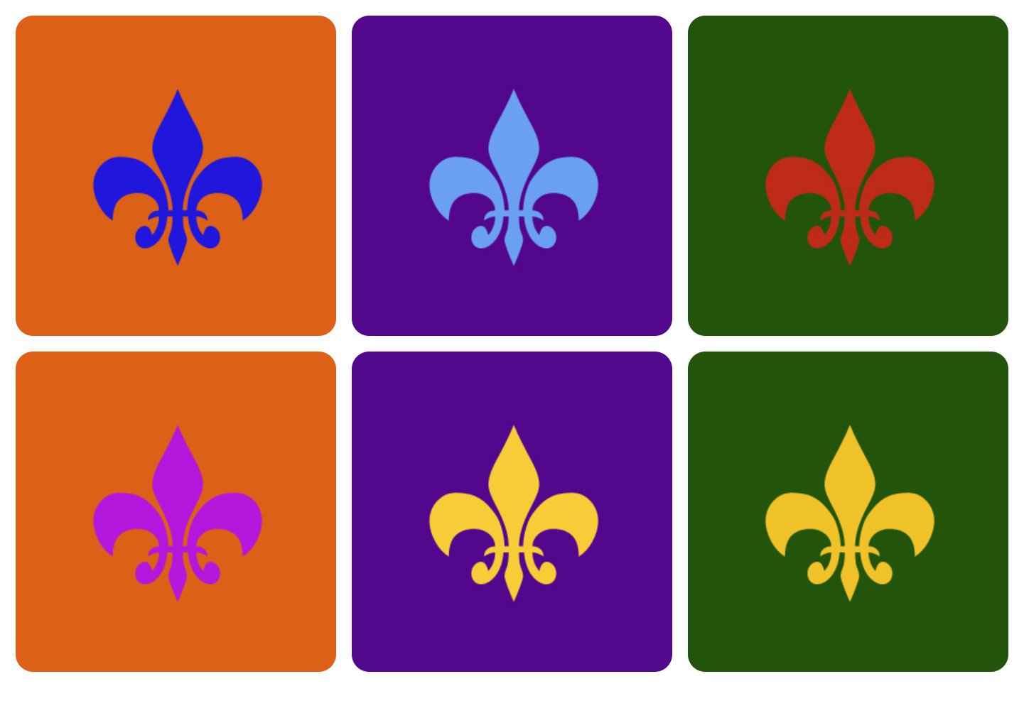
The three major complimentary color groups are green and red, orange and blue, and purple and yellow. By using this knowledge you can bring visual interest to an otherwise blah picture location. Let’s face it, while you may not be able to always control what your clients wear, you can control where they stand.

In the case of this little boy, if I had placed him in front of a green meadow or the blue sky, he would still be cute. By paying attention to what he is wearing and his eye color, I can plan for a more visually stunning effect. I noticed an old orange brick wall where we were and had him stand in front of it. By scouting my location ahead of time, I can map out where and what I want to photograph.

Whether you photograph children, landscapes, or objects, knowing your complimentary colors can vastly improve the look of your image. The photograph of this historical home was done at night as I experimented with HDR for the first time. The yellow stucco of the walls played will with the purple blue of the sky and made the home stand out from its surrounding brown Texas landscape. For your next photo session why not try implementing this element of art. It is one widely used in painting, marketing, and other art forms.
Meredith Ryncarz holds a M.Ed. in Art and has taught at several universities. She currently is the owner and principal photographer at Memories by Mere Photography. When she isn’t busy snapping photos or mentoring, she can be found chasing after her two crazy kids and trying out new foods with her foodie husband.